Style guide
White marble, floating cards, one violet accent. Product photos supply the colour; violet means act or verdict and nothing else.
Colour
--canvas
#f2f4f5Page background--surface
#ffffffCards, pills, inputs--ink
#000000Text, icons--slate-ink
#332f2dFooter, dark surfaces--muted
#6b6867Secondary text (AA on white)--muted-raw
#787574Icons, large text only--warm-fog
#acb0aaSecondary tints--stone
#ccccccPlaceholders--hairline
#ebebebDividers, outlines--accent
#5433ebThe only accent: act or verdict--accent-wash
#c0b5f3Halo behind accentType
Headline 48 / 600 / −0.05em
Title 28 / 600 / −0.035em
Section header 20 / 600 / −0.05em
Reading body 17 / 1.6 / −0.01em at a 68 character measure, used for long-form review text so it stays comfortable to read.
UI body 16 / 1.38 / −0.031em. Inter 400, 500 and 600 only; never bold 700.
Label 12, the floor for secondary text.
Shape and elevation
Card28px radius, shadow-card, no border
Inner20px radius
Floatingshadow-float
Buttons, pills and chips
Search
Sub-scores
Does the job 8.5 Owners consistently say it works first time.
Build quality 7.2 A few reports of the lever wearing out.
Ease of use 9.0 One-press operation.
Value 6.8 Costs more than plastic rivals.
Product cards
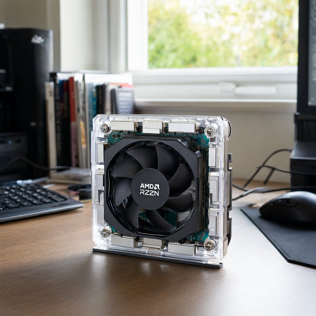
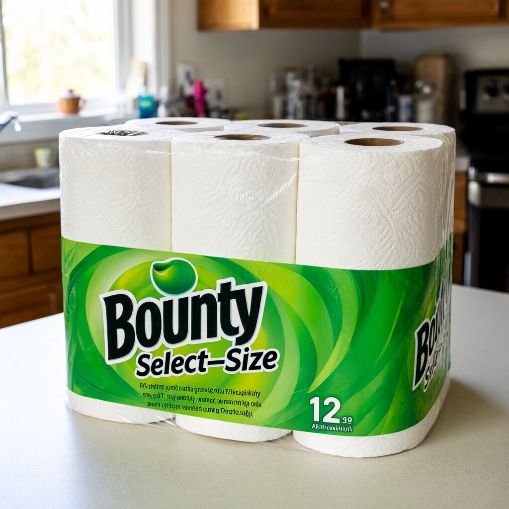
Icons
homegridawardsearchheartinfokitchentechtoolsoutdoorsbabypetofficerepeatcalendarexternal
Rules
- One accent. Violet only on the wordmark dot, the search button, the main "Check price" button and the score badge.
- No green, amber or red for scores. Scores are ink; pros and cons use + and − glyphs.
- Soft everywhere: no sharp corners except raw image edges.
- 12px gaps inside components, 64 to 80px between sections.
- Trust over tricks: no countdown timers, no "only 2 left", no pop-ups before content.
- AI images always say "AI illustration". Research scores always say so until Drew's notes are in.